Posts

Showing posts from 2018

Create library in Angular 4 and Angular 6

Image
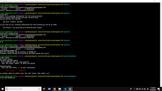
Create library in Angular 4:     /////////////////////////////////////////////////////////////     /////////////////  create Angular Lip  ////////////////////// 1.) ng new example-ng6-lib-app     rename folder name "example-ng6-lib-app" to "example-ng6-lib" 2.) cd example-ng6-lib     ng serve 3.) ng generate library example-ng6-lib --prefix=enl 4.) ng build example-ng6-lib 5.) import in module files ie..     import { BrowserModule } from '@angular/platform-browser';     import { NgModule } from '@angular/core';     import { AppComponent } from './app.component';     import { ExampleNg6LibModule } from 'example-ng6-lib';     @NgModule({     declarations: [         AppComponent     ],     imports: [         BrowserModule,         ExampleNg6LibModule     ],     providers: [],     bootstrap: [AppComponent]     })     export class AppModule { } 6.) to create more component in library use ie..     ng

Media query for most common ces

Media query for most common devices: @media (min-width:320px) { /* smartphones, iPhone, portrait 480x320 phones */ } @media (min-width:481px) { /* portrait e-readers (Nook/Kindle), smaller tablets @ 600 or @ 640 wide. */ } @media (min-width:641px) { /* portrait tablets, portrait iPad, landscape e-readers, landscape 800x480 or 854x480 phones */ } @media (min-width:961px) { /* tablet, landscape iPad, lo-res laptops ands desktops */ } @media (min-width:1025px) { /* big landscape tablets, laptops, and desktops */ } @media (min-width:1281px) { /* hi-res laptops and desktops */ } For all Phones: @media (min-width:320px) { /* smartphones, iPhone, portrait 480x320 phones */ } For All Portrait Devices: @media (min-width:641px) { /* portrait tablets, portrait iPad, landscape e-readers, landscape  For Landscape: @media (min-width:961px) { /* tablet, landscape iPad, lo-res laptops ands desktops */ } For Laptop and Desktop: @media (min-width:1025px) { /* big landscape table

How to create flex responsive table?

Flex table: For a long time, I've been looking for a really  easy way to handle tables in responsive on browser. Some technique's will make the responsive for lots of screen sizes, not just desktop vs. mobile. Having found now, I have done my own " flex responsive table " using CSS3 Flexbox, and here it is. DEMO: S/no Manufacturing Process Test/Inspect Qty Fail Qty Fail Rate Serial Number Product Build Date Product Ship Date Process one 23432 2986 298349823 029834 298y342y9834yy234 12/04/2018 320/07/2018 HTML/CSS:  https://github.com/rameshirreplaceable/flex/blob/ea761e09a1d7dc5c1a98d9b5ee0e9b97a3d1677a/index.html#L1